Elements
Line: The continuous lines lead your eyes to the stairs thus showing you where you need to go without actually putting up directions.
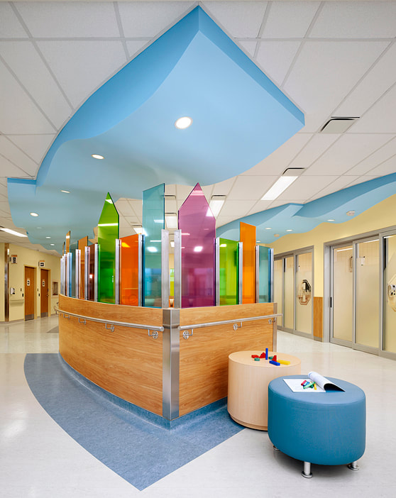
Colour: The bright colours here makes the reception desk pop out and seem like a more comfortable place for kids.
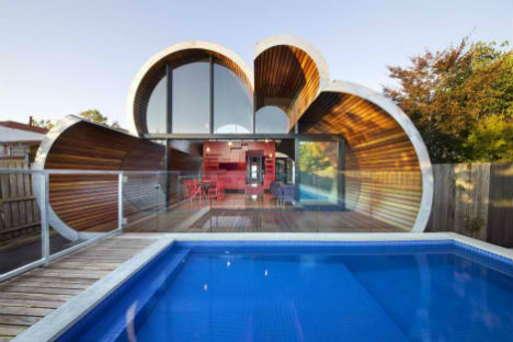
Form and Shape: This house is shaped like a cloud to give it a unique look and adds depth to the house.
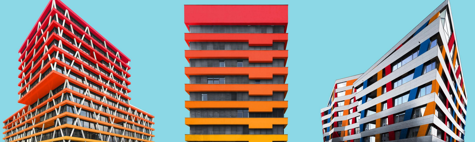
Value: These buildings have the colour red getting lighter to show the reduction of value.
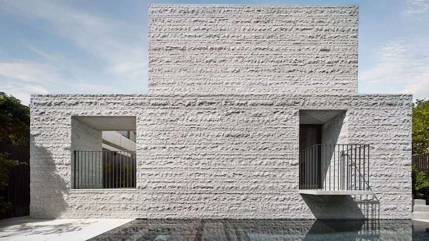
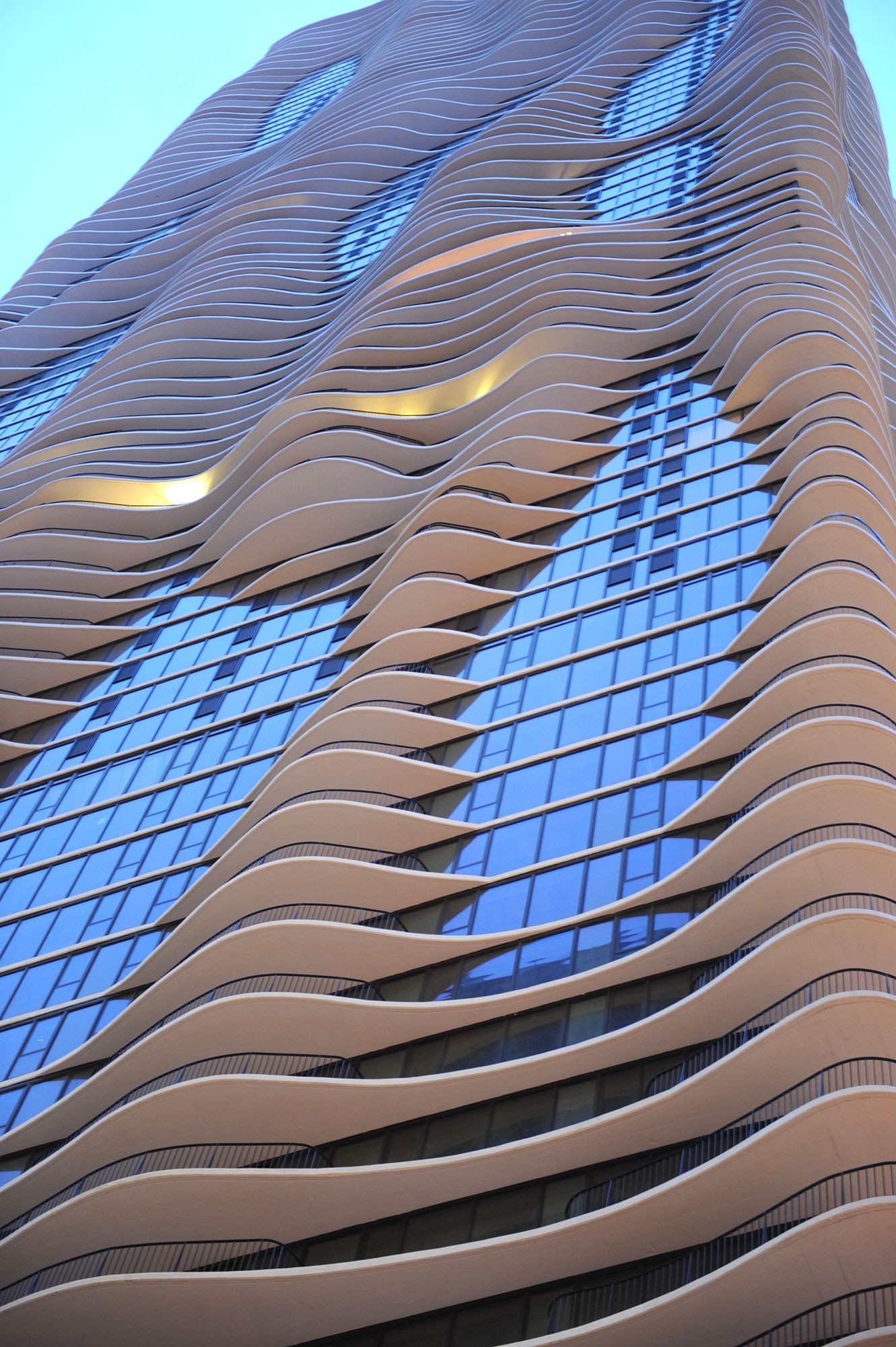
Texture: This building is textured to look like a canvas for a more appealing look.
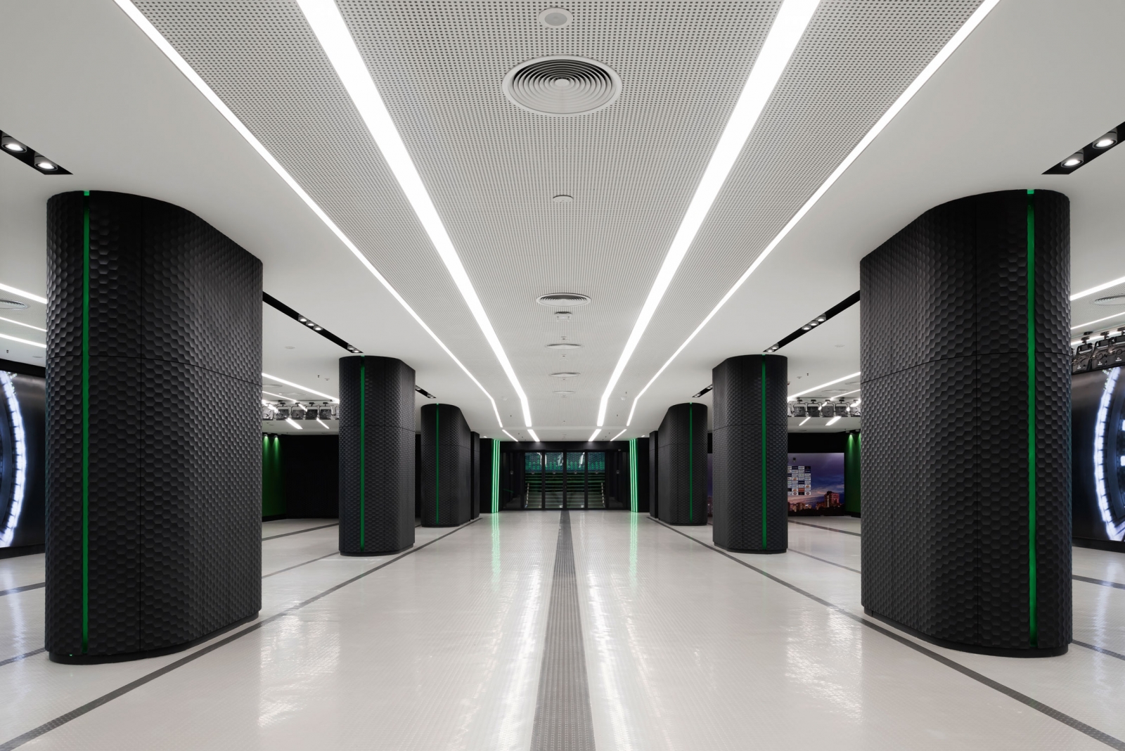
Space: This room is very minimalist and open to not only make it bigger but feel like the room has more space than it does.
Principles
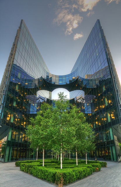
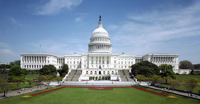
Balance: This building is vertically symmetrical to give it a more regal and important look.
Rhythm: The droopiness of this building gives it the illusion of movement and rhythm.
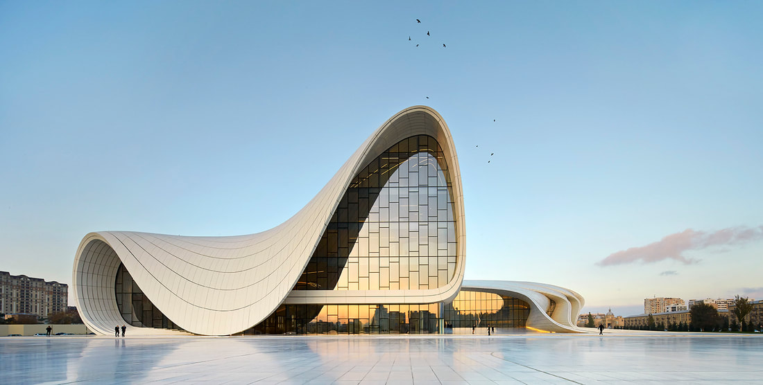
Emphasis: The indented windows puts emphasis on the windows and the wavy wall design.
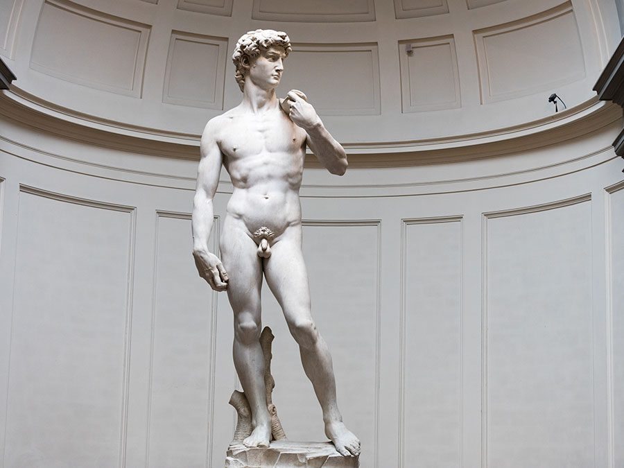
Proportion and Scale: The statue of David is often said to be ideal in proportion as well as powerful in size.
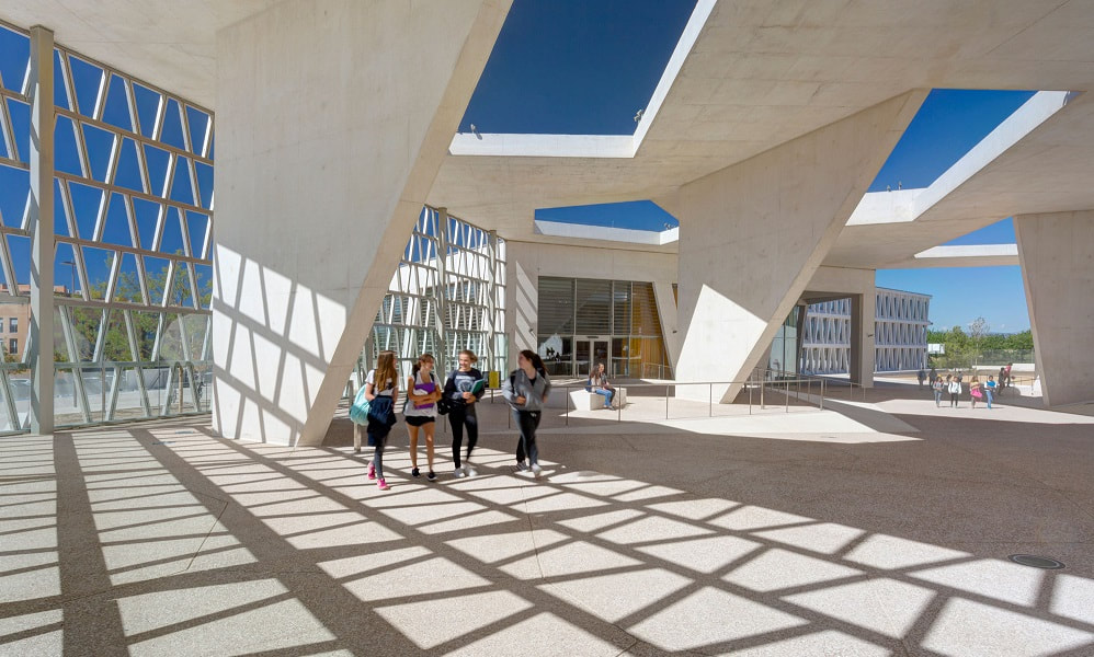
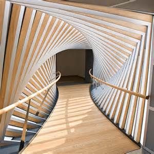
Movement: The angle of the walls and ceiling make it look like the hallway is spinning.
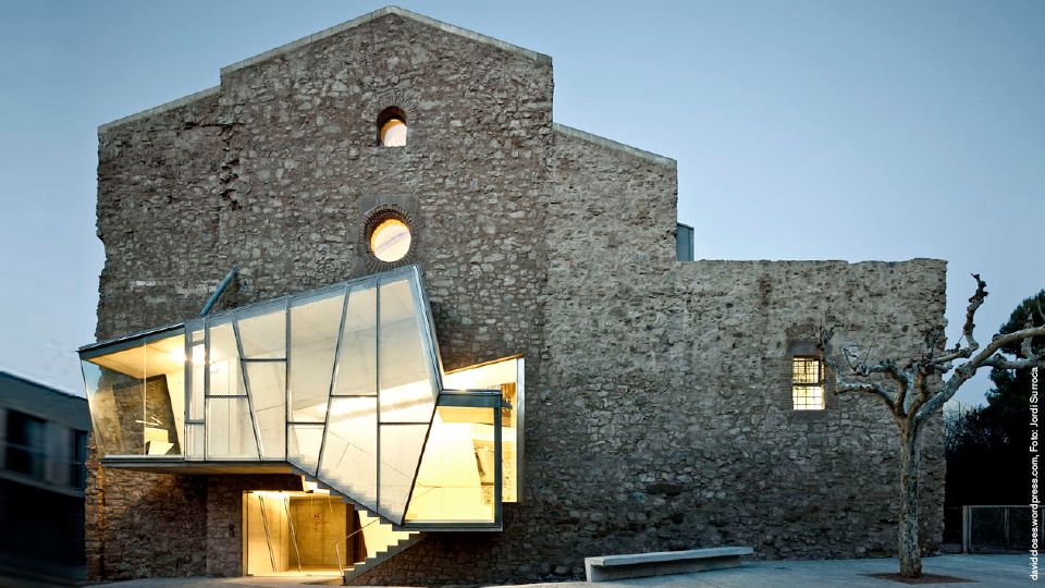
Contrast: The striking modern windows against the ancient stone walls causes the building to have a unique and eye-catching look.
Unity: The building is not only symmetrical but is connected by bridges that make it look more connected and unified.